

The Biggest Colour Mistakes Homeowners Make (And How to Avoid Them)

Choosing colours for your home sounds simple enough. You find a shade you love, buy the paint and start transforming the room. But anyone who has stood back from a freshly painted wall and wondered, “Why does that look completely different?” knows there is much more to colour selection than picking an attractive swatch.
Colour is affected by natural light, artificial lighting, surrounding materials, room orientation, furniture and even the time of day. A beautiful soft neutral in one Wellington home can appear cold and grey in another. A rich green that looks sophisticated on a sample card might become overwhelming when applied across four walls.
Avoiding these problems starts with understanding how colour behaves in a real interior. Working with an interior colour consultant Wellington homeowners can rely on can also take much of the uncertainty out of the process.
Here are some of the biggest colour mistakes homeowners make—and practical ways to avoid them.
Mistake #1: Choosing a Colour From a Small Paint Swatch
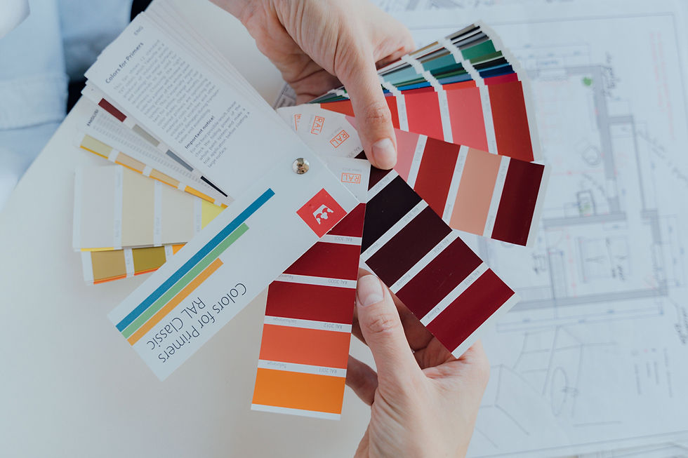
One of the most common mistakes is making a final decision based solely on a small paint chip.
Paint swatches are useful for narrowing down your choices, but they cannot accurately demonstrate how a colour will feel across an entire room. A few centimetres of colour viewed under shop lighting is very different from several square metres of painted wall in your home.
Colour also becomes much more dominant when it covers a large surface.
A subtle undertone that is barely noticeable on a sample card can suddenly become obvious once the colour is on the wall. That warm off-white might reveal a yellow or pink undertone. A sophisticated grey could unexpectedly look blue.
How to avoid it
Once you have shortlisted several colours, test them at home before making your final decision.
Use large painted sample boards or generous test areas rather than tiny patches. Move sample boards around the room and look at them beside flooring, curtains, furniture, cabinetry and other permanent finishes.
Most importantly, give yourself time to observe them before choosing.
Why Colours Look Different on Walls Than on Paint Swatches
If you've ever chosen the “perfect” colour at a paint shop only to discover that it looks completely different at home, you are not imagining it.
Several factors cause this.
The size of the colour changes your perception
A colour covering an entire wall has significantly more visual impact than the same colour on a small card. Strong colours can feel stronger, while subtle undertones often become easier to see.
Lighting changes colour
Paint does not exist independently of light. Natural and artificial light affect how our eyes perceive colour.
A shade can appear warm and inviting in direct sunlight but cooler or duller when the room becomes shaded. Artificial lighting can change it again in the evening.
This means there is rarely one fixed version of a paint colour. What matters is how that colour behaves in your particular home.
Surrounding colours influence what you see
Your flooring, furniture, curtains, benchtops, cabinetry and adjoining rooms all affect how a wall colour is perceived.
Put the same white next to a warm timber floor and a cool grey floor, for example, and it can appear surprisingly different.
This interaction is one reason choosing colours individually rather than as a complete palette can lead to disappointing results.
Mistake #2: Ignoring the Room's Natural Light
A Pinterest image or beautifully styled magazine room can be excellent inspiration, but copying its wall colour does not guarantee the same result in your house.
The amount and quality of natural light entering your room play a major role in how colour appears.
A bright room receiving plenty of sunlight can often accommodate colours differently from a darker room with limited natural light. Wellington's changing weather conditions can also mean your interiors experience dramatically different light throughout the day and across the seasons.
How to avoid it
Observe your room before selecting the final colour.
Look at where the natural light comes from, when the room is brightest and which areas remain shaded. Then test your shortlisted colours under those actual conditions.
Don't judge them once. Look at your samples in the morning, around midday, late afternoon and after dark with your normal lights switched on.
The colour you love at 11am needs to work at 8pm too.
Mistake #3: Forgetting About Undertones
Whites, greys, creams and beiges are not as neutral as they might initially appear.
Almost every neutral has an undertone.
Whites may lean towards yellow, pink, grey, green or blue. Greys can have warm brown undertones or cool blue and green influences. Beige can shift towards pink, gold or grey.
These differences become particularly important when colours are placed beside existing materials.
For example, a cool white paired with warm cream tiles may make the tiles look more yellow than expected. A grey with a blue undertone could clash with warm timber cabinetry.
How to avoid it
Compare colours against the fixed elements that are staying in the room.
That includes:
Flooring
Kitchen cabinetry
Benchtops
Tiles
Curtains
Large pieces of furniture
Timber finishes
Existing feature materials
A successful colour palette should connect these elements rather than fight against them.
Mistake #4: Choosing Every Room Separately
Another common approach is treating each room as an independent decorating project.
You choose a blue for one room, a grey for another, a different white in the hallway and perhaps a completely unrelated green somewhere else.
Each colour might look attractive individually, but the home can begin to feel disconnected.
How to avoid it
Think about your house as a complete visual journey.
Rooms don't need to be identical, but there should be some relationship between them. Repeating undertones, complementary shades or a consistent neutral can create a sense of flow.
This is particularly important in open-plan homes where several spaces are visible simultaneously.
Developing the overall palette first can make individual colour decisions considerably easier.
Mistake #5: Automatically Choosing White Because It Feels “Safe”
White is often treated as the safest possible interior colour. But choosing white successfully can be surprisingly complicated.
There are warm whites, cool whites, creamy whites, grey whites and countless variations in between.
A white that looks crisp in one home can appear sterile in another. Another may look fresh in the paint shop but noticeably yellow once applied beside your flooring or cabinetry.
White is still colour—and needs to be selected with the same care as any other shade.
How to avoid it
Don't simply ask for “white.”
Consider the other finishes in your home and identify whether they generally have warm or cool undertones. Test several whites against those materials and observe them under your home's lighting conditions.
Mistake #6: Following Trends Without Considering Your Home
Colour trends can provide fantastic inspiration. Deep greens, earthy neutrals, warm whites and dramatic darker colours can all create beautiful interiors.
The mistake is assuming a trending colour will automatically suit your house.
Your home's architecture, natural light, existing materials and personal style matter more than what happens to be fashionable this year.
How to avoid it
Use trends as inspiration rather than instructions.
Ask yourself whether you genuinely enjoy the colour and whether it works with your home's existing features.
A thoughtfully selected colour palette should feel personal to you rather than simply reflecting the latest social media trend.
Mistake #7: Being Too Afraid of Colour
At the opposite end of the spectrum, some homeowners become so worried about making a mistake that they remove almost all colour from their interiors.
Neutral spaces can be beautiful, but neutral doesn't have to mean colourless.
Muted greens, dusty blues, warm earthy shades and subtle tonal variations can add personality without making a room feel overwhelming.
Even a carefully selected front door, kitchen island, powder room or feature area can introduce colour in a manageable way.
The key is choosing colour deliberately.
Mistake #8: Not Considering Artificial Lighting
Homeowners often test colours during daylight and forget how much time they spend in the same rooms after sunset.
Your lighting can substantially affect paint colours.
Different bulbs produce different colour temperatures. Warm lighting can enhance creams, warm whites and earthy colours, while cooler lighting can alter how those same shades appear.
How to avoid it
Always assess paint samples at night with the lights you normally use.
If you're planning a major renovation or new build, think about your lighting and colour palette together rather than treating them as completely separate decisions.
Practical Tips Before Committing to a Paint Colour
Before ordering litres of paint or booking the painter, take a little extra time to test your decision properly.
Shortlist rather than committing immediately. Choose several promising shades first.
Create large samples. A larger painted area gives you a much better impression than a small swatch.
Move samples around. Look at the colour on different walls and next to important finishes.
Check morning and evening light. A colour needs to work throughout the day.
Switch on your lights. Evaluate the colour under artificial lighting as well as daylight.
Compare undertones. Pay particular attention when choosing whites, greys and other neutrals.
Consider adjoining rooms. Make sure your palette flows naturally from one space to another.
Don't rush. Living with your samples for several days can prevent an expensive repaint.
Keep permanent materials in mind. Flooring, tiles, cabinetry and benchtops are usually more difficult and expensive to replace than paint.
Ask for professional guidance when you're stuck. A second pair of experienced eyes can identify undertones and combinations that can be difficult to recognise when you've been looking at dozens of samples.
When an Interior Colour Consultant Can Help
Colour decisions can become especially complicated during renovations and new builds because you're often selecting several finishes at once.
Wall colours need to complement flooring. Flooring needs to work with cabinetry. Cabinetry interacts with benchtops, tiles, furnishings and lighting.
One decision affects another.
An interior colour consultant in Wellington can help bring those individual choices together into a coordinated palette.
At All Colour Matters, Kim has been working with colour in homes and offices since 2000, helping clients create spaces that reflect their personal style. The process begins with the colour palette, with guidance available whether you're already midway through a project, facing the blank canvas of a new build or simply unsure where to begin.
Professional colour advice isn't about someone imposing their personal taste on your home. It's about helping you understand which colours work with your space, your existing materials and the atmosphere you want to create.
Create a Home Where the Colours Work Together
The most successful interiors aren't necessarily those using the trendiest paint colour or the boldest design choices.
They're the homes where everything feels connected.
Good colour selection considers light, undertones, existing finishes, adjoining rooms and, most importantly, the people living in the space.
So before committing to your next paint colour, resist the temptation to choose from a tiny swatch and hope for the best. Test your options properly, observe them throughout the day and think about how each colour contributes to the overall palette.
And if you're surrounded by paint samples and finding it harder—not easier—to make a decision, professional guidance can simplify the process.
All Colour Matters provides colour and interior design guidance for homes and projects in Wellington, helping clients move from colour uncertainty to a palette designed specifically for their space.

Comments